


Prescription dispenser
Table of Contents
Sign up to our newsletter
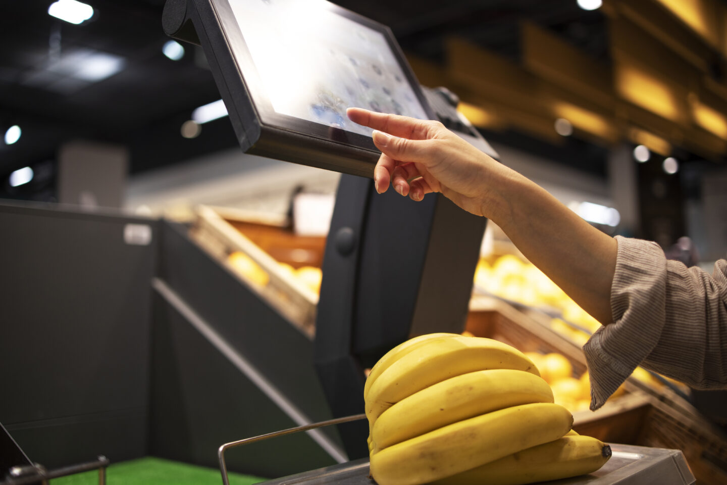
Self-service kiosks do not win because they exist. They win because people actually use them without hesitation. When users abandon a kiosk flow and look for staff, adoption drops, lines grow, and the kiosk becomes a cost center instead of a performance lever.
This guide shares best practices for user-friendly self-service tools specifically for kiosks, with one goal: increase completion, reduce abandonment, and make self-service the first choice.
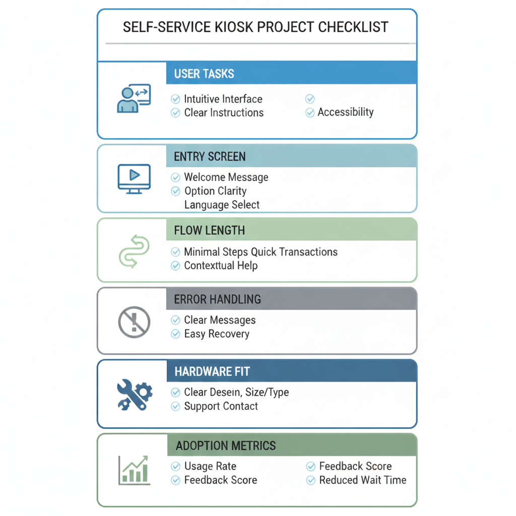
Define Kiosk Self-Service Adoption by Top User Tasks
Adoption is not a feature checklist. Adoption is a user completing a real task successfully on the kiosk.
Start by defining the few tasks that matter most. In most kiosk deployments, a small set of high-frequency tasks accounts for most usage and most support pressure. If those tasks are fast and obvious, adoption rises. If those tasks are slow or confusing, the kiosk gets avoided.
Build your kiosk experience around three decisions:
- Pick the top three to five tasks.
Choose tasks users already want to do, especially those that create lines or repeat staff work. - Design the shortest path to success for each task.
Remove steps that do not change the outcome. If a step exists only because the back office likes it, it will cost you adoption. - Separate first-time and repeat behavior.
First-time users need clarity and guidance. Repeat users need speed. You can serve both by keeping the default path simple and offering an optional fast lane after the core flow is proven.
When your entry screen is aligned to top tasks, the kiosk feels helpful instead of complicated.
Make Kiosk Self-Service Obvious in the First 30 Seconds
The first 30 seconds decide whether a user commits or walks away. Your first screen must deliver confidence instantly.
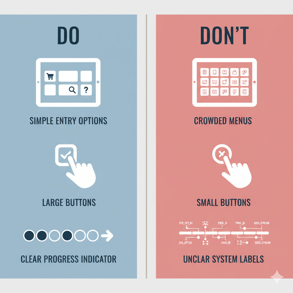
A strong first screen answers three questions without effort:
- What can I do here?
Show a small set of outcome-based options that match user intent. Keep choices few and easy to scan, so users instantly recognize the right starting point. - What should I tap next?
Make one primary action visually dominant. Use clear, familiar labels that describe outcomes, not internal categories. - Is this safe?
Reduce hesitation by making actions feel reversible. Keep help visible and include a clear review step before anything final, especially when money or personal data is involved.
If the first screen feels like a menu of internal tools, adoption will always be fragile.
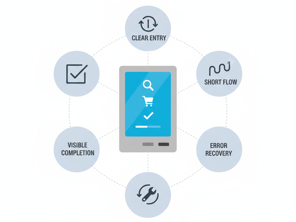
Build a Short, Predictable Kiosk Self-Service Flow Users Can Finish
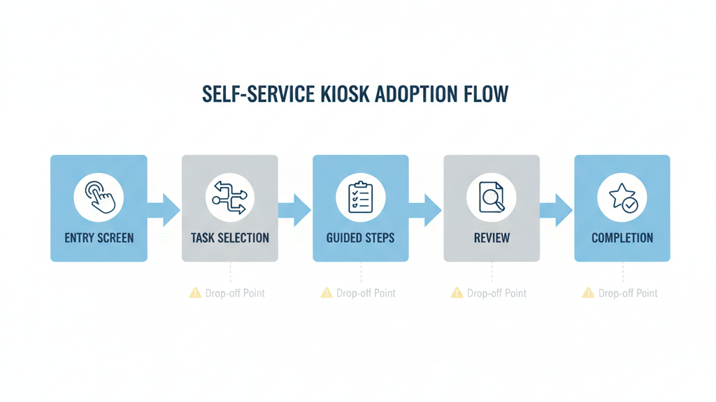
User-friendly self-service is not about having fewer screens. It is about making the flow feel predictable, steady, and finishable. Design the flow so users always know where they are, what happens next, and how close they are to done.
- Use one decision per screen.
When a screen asks multiple questions, error rates go up. Keep each step focused. - Reduce branching early.
Branching is where kiosks lose people. Use guided choices that quickly narrow the path instead of sending users into long trees. - Make progress visible.
A simple progress indicator reduces anxiety and prevents drop-off near the end. Users stay engaged when they can sense the finish line. - Keep steps consistent across tasks.
Consistency builds confidence. When the user learns how one kiosk task works, they should be able to transfer that learning to the next task. - End with a clear completion moment.
Do not leave users guessing. Confirm what happened, what they received, and what to do next. A strong completion state reduces repeat attempts and follow-up questions.
A predictable flow turns first-time users into repeat users. That is how adoption compounds.
Prevent Abandonment With Smart Recovery and Error Handling
Public devices are messy environments. People get interrupted. They mistap. They hesitate. Recovery design is not optional. It is where adoption is protected.
- Make actions reversible.
Users should be able to go back, edit, and correct mistakes without restarting the whole process. Restarts are a top abandonment trigger. - Write error messages that move users forward.
A useful error message does not explain the system. It explains the situation. It clearly states what went wrong in plain language, tells the user exactly what to do next, and keeps the flow alive instead of forcing a restart or dead end. - Avoid technical codes and vague warnings.
If the kiosk cannot proceed, the user needs a clear next step, not a diagnosis. - Handle timeouts gently.
Timeouts happen when users look away, reach for a card, talk to someone, or read a prompt. When a timeout occurs, offer a simple continue option before forcing a restart. - Plan for walkaways.
If a user leaves mid-flow, the kiosk should clear sensitive data quickly, but it should also avoid punishing normal pauses. Balance privacy and usability with smart timers and clear prompts. - Provide proof when it reduces anxiety.
For many kiosk tasks, users want something they can keep. That can be a printed receipt, an on-screen confirmation number, or a QR code that saves the result. When users feel they have proof, they trust the kiosk more and ask staff less.
Recovery design is not just support hygiene. It is adoption insurance.
Align Hardware and Environment for User-Friendly Kiosks
Even the best interface fails if the physical setup creates friction. User-friendly self-service requires the right match between task, hardware modules, and real environment.
- Screen size sets your information density.
Smaller screens need fewer choices, larger touch targets, and shorter text. If your UI depends on dense lists, the physical screen will fight you. - Touch target size shapes confidence.
Public users tap faster when buttons are clearly tappable. If your design requires precision, errors will rise and adoption will fall. - Installation height affects real completion.
A kiosk that is uncomfortable to reach will be avoided. The best UI cannot overcome poor ergonomics. Consider accessibility needs early because retrofits are costly. - Modules change the flow and the failure points.
Payment, printing, scanning, cameras, and readers can shorten a process or introduce new friction. Every module you add changes the user journey. Choose modules that simplify tasks, not modules that merely add capability. - Lighting and reflections can destroy readability.
Glare turns a clear interface into a guessing game. Test in the real location at the real time of day. - Feedback cues reduce repeated taps and confusion.
Users need confirmation that the kiosk registered input. Clear visual feedback matters. In some environments, simple audio cues can help too, especially when the screen is busy or the user is in a hurry.
When hardware and environment align with the flow, adoption rises without extra training or signage.
Measure and Improve Kiosk Self-Service Adoption After Launch
The first version is rarely the best version. Adoption improves when you treat the kiosk as a living system.
Measure outcomes, not activity
The most useful metrics are:
- completion rate by task
- average time to complete
- abandonment rate by step
- error rate by screen
- repeat attempts for the same task
- escalation rate to staff and the reasons
Find the drop-off points and fix them fast
Most adoption gains come from small changes: better entry labels, fewer steps, clearer confirmations, and more helpful error messages.
Iterate with a pilot mindset.
Launch in a limited set of locations, learn quickly, and improve before wider rollout. Real users in real environments reveal problems that internal reviews miss.
Use support feedback as design input
When staff repeatedly answer the same kiosk question, that is a UX bug. Fix the interface and the script disappears.
Adoption is not a one-time achievement. It is the result of continuous friction removal.
Conclusion
User-friendly self-service in kiosks is not about adding more options. It is about making the right tasks obvious, making the flow predictable, and making mistakes recoverable. When users can finish quickly and safely, they adopt self-service naturally and return to it confidently.
If you want kiosks that drive real adoption, design around top tasks, win the first 30 seconds, protect users with strong recovery, align hardware with the environment, and keep improving after launch.

Kitty Tan
Custom Kiosk Expert Consultant
Kitty is a kiosk expert at FlyXing. With extensive knowledge and experience in designing and manufacturing self-service kiosks, Kitty specializes in creating customized solutions to meet diverse industry needs.
